
Snackable City
Where Do Our Time and Money Really Go?
Project
University Project
Year
2025
Services
Role
Creative Direction
Design Research
Data Visualisation
Industry
Education
Location
Amsterdam
About the portrait
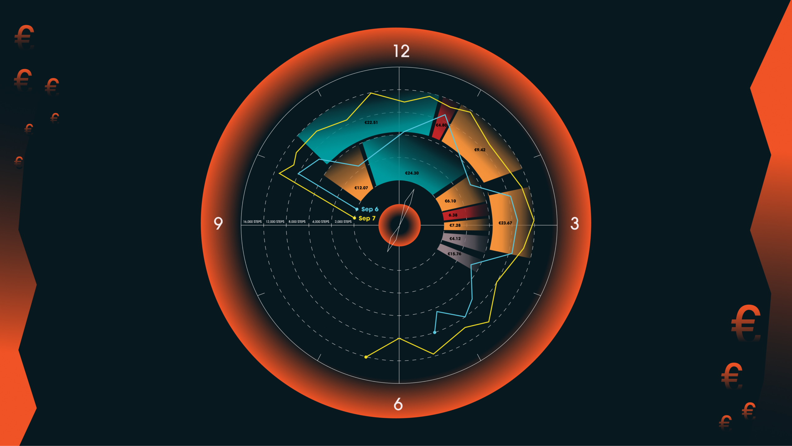
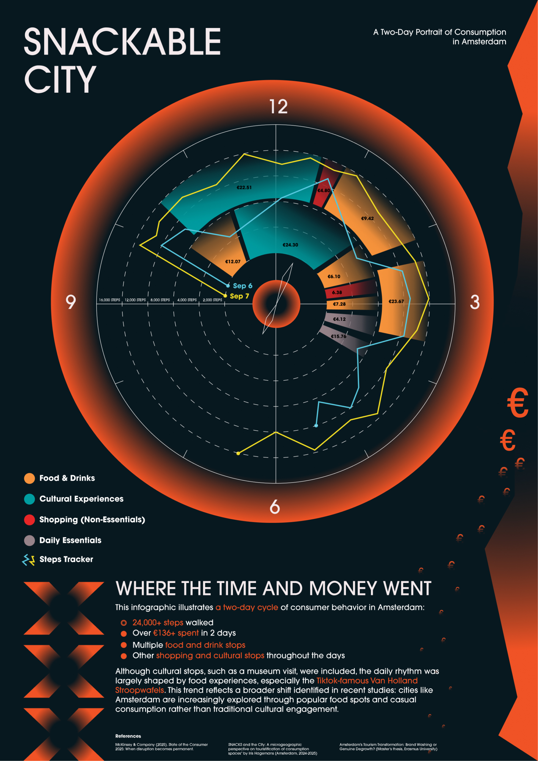
My data portrait, “Snackable City,” visualizes two days of consumer behavior in Amsterdam. It combines traces from Google Maps and the Health app to show steps, movements, and activities such as cafés, shopping, and cultural visits, along with the money spent at each stop.
When I first inspected the two datasets, what stood out was that everything was tied to time: arrival and departure moments, walking steps spread through the day, and spending amounts recorded next to each activity. Since the data was already structured around time and covered exactly two days, I chose a clock as the central concept. The circular format captures the daily rhythm, showing when activities happened, how long they lasted, and where money flowed. In this way, fragmented traces became a clear cycle of consumption.
What Does the Data Reveal About Two Days in Amsterdam?
The data highlights a two-day cycle shaped heavily by consumption. The person walked more than 24,000 steps and spent over €136. The majority of this went to Food & Drinks, including TikTok-famous Van Holland Stroopwafels, while shorter bursts of time and money were spent on shopping and daily essentials. Cultural visits, such as a museum and a cinema, were present but less dominant.
This pattern echoes wider trends in Amsterdam where food tourism, influenced by social media, often eclipses slower cultural engagement. Visualizing the data makes these rhythms clear, but it also raises concerns about how much of daily life can be reduced to categories of consumption.
Who Owns Our Data and Is It Ethical to Visualize It?
The data came from Google Maps and the Health app, both of which continuously collect personal traces, often more than users realize. Even though my poster anonymizes the individual, it still demonstrates how easily a portrait of someone’s life can be reconstructed: where they went, what they did, and how much they spent.
This raises ethical questions. Who owns the data, the individual or the platform? Is it ethical to visualize someone’s intimate movements and spending habits without their consent? And what risks exist if such portraits are made public, such as surveillance, profiling, or exploitation by advertisers?
What Do These Patterns Tell Us About the Age of Datafication?
Personal data can create powerful insights and storytelling, but it also exposes vulnerabilities. In an age of digitization and AI, the datafication of everyday life is accelerating. Corporations profit from the traces we leave behind, while individuals often lose control over how their data is used. Designers, researchers, and educators must therefore ask: Should personal data be used for aesthetic or educational purposes, and if so, under what conditions?
This portraint revealed not only consumption patterns in Amsterdam but also the fragility of privacy in the digital age. Infographics like mine can make daily life visible and engaging, but they should also provoke critical reflection: who benefits when our lives are turned into data, and what responsibilities do designers have when representing it?
References
- Adams, C., Alldredge, K., & Kohli, S. (2025, June 9). State of the Consumer 2024: What’s Now and What’s next. McKinsey & Company. https://www.mckinsey.com/industries/consumer-packaged-goods/our-insights/state-of-consumer
- Hagemans, I. W. (2024). Snacks and the City. https://doi.org/10.33540/2593
- Brambilla, M. (2024). Amsterdam’s Tourism Transformation: Brand Washing or Genuine Degrowth? https://thesis.eur.nl/pub/74775/13673.pdf